lill.com is for sale!



Strong Buyer Interest
Recently viewed or shortlisted by 7+ buyers.
 Secure Transactions
 Fast Domain Transfers
 Flexible Payments
About lill.com
Lill.com
Some names become valuable because they can carry more than one story.
Lill is one of them.
Four letters.
One syllable.
Pronounced naturally as “lil.”
Soft, friendly and instantly familiar.
Then the name starts opening up.
In Estonian, “lill” means “flower.”
In English, the sound naturally recalls “little.”
And in lowercase, something else happens:
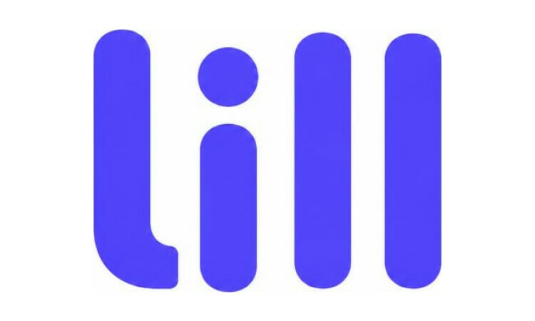
lill
The name itself becomes a visual identity.
Simple. Minimal. Playful. Distinctive.
From “little” to something much bigger
Lill has an immediate emotional connection to the world of children.
Little ones.
Little steps.
Little discoveries.
Little dreams.
Little moments.
That makes Lill feel naturally at home in categories such as kids fashion, baby products, toys, learning, nursery, furniture, parenting, family technology and children’s media.
The name does not need to literally mean “little.”
It simply sounds close enough to create the association.
And that association is useful.
A brand called Lill can feel small, warm and affectionate without feeling childish.
That distinction matters.
The child can connect with it.
The parent can still see it as premium.
The positioning starts to appear almost immediately:
“Made for little ones.”
“Little by little.”
“Grow with Lill.”
“Big things start small.”
Lill can begin with childhood.
But it does not have to stay there.
Then there is the flower
In Estonian, “lill” means “flower.”
That gives the same four letters another layer entirely.
Growth.
Beauty.
Nature.
Care.
Colour.
Renewal.
Something small becoming something more.
For a children’s brand, the two ideas work beautifully together.
A child grows.
A flower grows.
Both begin small.
Both need care.
Both become something extraordinary.
That turns Lill from a cute name into something with emotional depth.
And outside the children’s category, the flower meaning opens completely different territory:
beauty.
fragrance.
fashion.
wellness.
home.
hospitality.
design.
The name can be playful or refined depending on how the brand chooses to use it.
The lowercase wordmark is where it becomes special
Look at it carefully:
lill
The lowercase form creates a repeated vertical rhythm.
l i l l
The three lowercase “l” characters behave almost like slim posts or stumps.
The “i” continues the vertical structure, while its dot adds one small point of personality.
That gives Lill an unusually strong visual foundation before a designer has even started.
For a children’s brand, those forms could become:
building blocks
pencils
tree trunks
height marks
little characters
stems
playful objects
For a more sophisticated brand, nothing may need to be added at all.
Just:
lill
In the right typography, the name itself can become the logo.
That is rare.
Most brands need a symbol to create recognition.
Lill already contains a visual system inside the letters.
Familiar without being ordinary
Lill also benefits from phonetic familiarity.
It sits close to:
Lily.
Lilly.
Lil.
Those sounds are already associated with softness, femininity, flowers, names and affection.
But Lill is cleaner.
Shorter.
More geometric.
More modern.
It feels less like a traditional given name and more like a brand.
That gives it an interesting balance:
familiar enough to remember quickly.
distinctive enough to become proprietary.
And the double-L ending gives the word a firm, complete finish.
There is also a proven commercial precedent for compact four-letter names with this kind of “-ill” construction.
Dell and Bill are both major established four-letter .com identities. Your brand dataset places Dell among the highest-ranking names and Bill among the stronger exact four-letter brands.
The industries are irrelevant.
The useful lesson is structural.
Four short letters.
One syllable.
A clean “-ill” ending.
Strong enough to become the company itself.
Lill adds something those examples do not have:
softness.
emotion.
and multiple natural stories.
A brand that can grow with the audience
Imagine Lill beginning as a premium baby brand.
Then expanding into children’s clothing.
Furniture.
Home.
Family lifestyle.
Education.
Travel.
Wellness.
The name still works.
Or imagine it beginning in beauty.
Then fragrance.
Fashion.
Hospitality.
Design.
Again, the name still works.
That is the advantage of a strong master brand.
It does not describe the first product too precisely.
It gives the company room to become larger than it began.
Lill has that flexibility.
The “little” association gives it warmth.
The flower meaning gives it emotional richness.
The lowercase form gives it visual identity.
And the short four-letter structure gives it scale.
Then there is Lill.com
The strongest version of the brand is simply:
Lill.
Lill.com.
Nothing added.
No modifier.
No extra word.
No compromise in the address.
If the company grows, those four letters can travel everywhere:
products.
packaging.
apps.
email.
advertising.
stores.
hotels.
media.
conversation.
And because the name is so short, every repetition strengthens it.
The domain begins as an address.
Over time, it can become part of the identity itself.
Lill.com.
Four letters.
One syllable.
A connection to “little.”
A real meaning of “flower.”
A lowercase wordmark with its own visual rhythm.
And enough room for one company to decide what Lill ultimately becomes.
lill
Small in letters.
Big in possibility.
Does lill.com fit your brand?
Purchase Domain







Buy with Confidence
- Ownership verified
- Payment protected until transfer is complete
- Fast, guided transfer
Purchase Protection Program
100% refund guaranteed if domain can't be transferred. Learn more
Track Price
Great domains rarely drop in price. Get notified of any changes to lill.com.
Need help?
Step-by-Step Purchase Guide